PR Campaign Examples: 8 Recent Wins and What They Teach You


Let me guess. You searched “pr campaign examples,” opened three articles, and every one of them led with the ALS Ice Bucket Challenge. Again.
I get why. It’s the easy example. It’s also more than a decade old, and nobody’s running ice-bucket plays in 2026.
So here are eight PR campaign examples from 2025 and 2026 instead — recent enough that the playbook still works, with numbers you can drop into a pitch meeting and not get laughed out of the room. A few are billion-dollar brands. One is a pizza place in Norwich that spent absolutely nothing and ended up in Reuters. The thread running through all of them is the same: the best PR campaigns don’t buy attention. They earn it, and they make people want to pass it on.
What makes a PR campaign work (and what makes it flop)
Quick definition, then the good stuff. A PR campaign is a planned run of activity built around one message, pointed at a specific target audience, with a start date and an end date. It’s not advertising. Ads rent space; public relations earns it — a journalist’s write-up, a creator’s post, a Reddit thread that catches fire on its own — and that’s precisely why people believe it more than a brand talking about itself.
Here’s the part most marketers forget: that earned press coverage links back to you, gets shared around, and quietly props up your SEO and visibility for ages. The campaigns that land tend to share three things — a real idea, a creative that stops the scroll, and timing. Hit all three, and you build brand awareness on a budget that would make a CMO cry happy tears. The stronger your earned media coverage, the longer your brand reputation holds up too. Get only two? Congrats, you’ve made an ad nobody asked for.
The best PR campaign examples of the last two years (2025–2026)
Here are the public relations campaigns I’d actually study right now. Different industries, wildly different budgets, one shared backbone.
1. Vaseline Verified: social listening that turned into media coverage
This is the one I’d steal first. Vaseline spotted something most brands would’ve panicked over: TikTok and Instagram were full of people using its petroleum jelly in weird, unproven “hacks.” Slugging, lash growth, you name it. Instead of firing off a stiff legal disclaimer, the brand hired actual scientists to test the hacks and slapped a #VaselineVerified seal on the ones that held up.
A 153-year-old jar of goo, out-marketing skincare startups at their own game. It reportedly pulled in around 136 million views, a 43% sales uplift, and roughly 87% positive sentiment, then took Social Campaign of the Year at the Ad Age Creativity Awards and rolled into 2026.
The smartest PR move here wasn’t the lab coats. It was that the whole thing started by listening to what people were already saying, then handing it back to them. That’s social listening doing the work before anyone briefs a single asset.
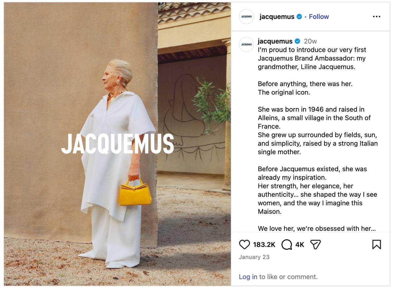
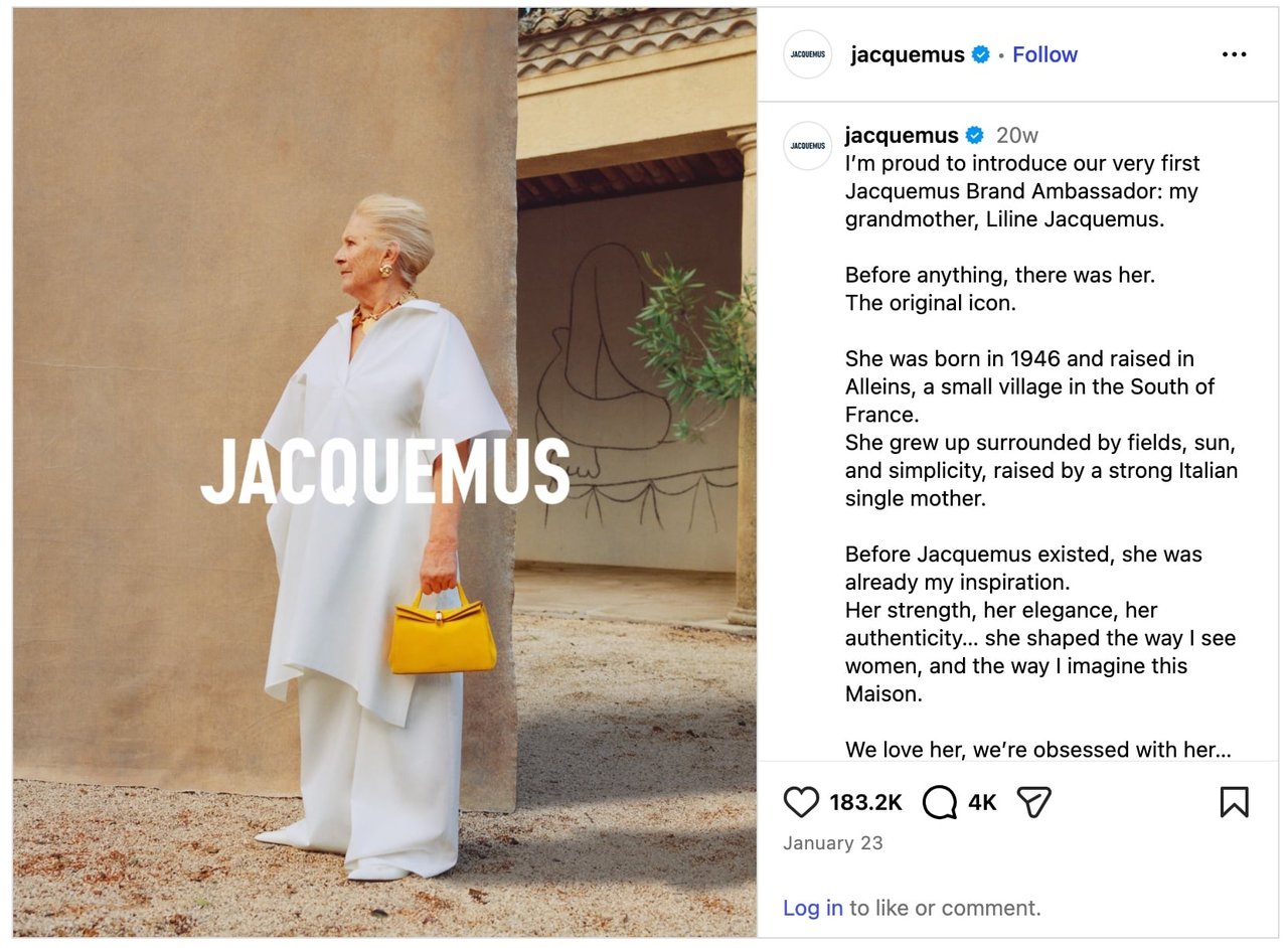
2. Jacquemus made its founder’s grandmother the face of the brand
Fashion is allergic to this kind of move, which is exactly why it worked. In 2026, Jacquemus skipped the supermodels and the AI-rendered faces and named the founder’s own grandmother, Liline, its first-ever brand ambassador. They published the contract. No focus group greenlights that — and that’s the point. It read like a person, not a campaign, so people couldn’t stop sharing it. You can’t fake that. Don’t try; find the real version sitting in your own story.
3. Coors Light’s “Mondays Light”: the typo nobody fixed
Around the Super Bowl in January 2026, Coors Light leaned into everyone’s collective Monday dread. It “accidentally” printed “REFERSHMENT” instead of refreshment on its site, dropped a chilled “face roller” shaped like a gua sha tool, and put out limited “Mondays Light” packs.
The typo was on purpose, obviously. Reddit and LinkedIn did the rest. A planned mistake out-earned half the polished product launches that quarter, which probably tells you how much we’ve all stopped trusting polish.
4. IKEA’s “The Co-Worker”: a recruitment campaign, and why it worked
Okay, this one’s a masterclass. IKEA UK & Ireland built a working store inside Roblox and let people apply for a real, paid job by doing the gamified version of it — flat-pack assembly, virtual meatballs, the whole bit.
Sounds like a gimmick. The numbers aren’t. Roughly 178,000 applications in two weeks. Around 2,000 news stories. An estimated 16 billion earned-media impressions, and a reported 50% bump in actual job applications. It also grabbed a Webby (People’s Voice), which put IKEA among the year’s award winners.
Recruitment marketing is usually the dullest thing a company does. IKEA turned its version into a game people wanted to play. That gap — between “boring category” and “thing people share” — is where the best PR campaigns live.
5. Sweaty Betty’s #WearTheDamnShorts: body positivity, out on the streets
May 2025. Sweaty Betty rolled out a global, female-led campaign with a message you couldn’t soften if you tried: wear the damn shorts. Real thighs, cellulite, stretch marks, veins, blown up huge across out-of-home and social, with lines like “getting your legs out has no age limit.” Nothing airbrushed.
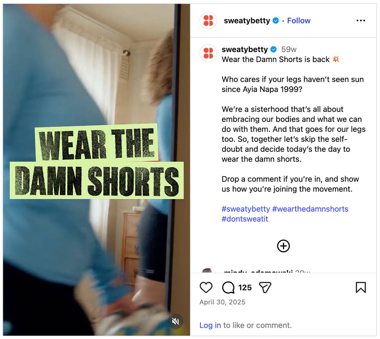

It hit a nerve, and the user-generated content poured in across social media platforms with zero paid influencers — the hashtag basically handed people permission to post their own legs. That’s how you earn brand loyalty instead of renting attention. (Quick honesty check: the slogan later got tangled in a credit dispute, so don’t lift the exact wording. The mechanic — honest message plus a rallying cry people can act on — is the part worth copying.)
6. Lupa Pizza’s £100 Hawaiian: how a tiny shop muscled into the global press
This one shouldn’t have worked, which is why I love it. Lupa Pizza is a small independent place in Norwich. In January 2025, it stuck a Hawaiian pizza on its Deliveroo menu for £100 — not to sell it, but as a half-joke protest in the world’s dumbest food argument.
Within a day, The Guardian, CNN, and Reuters had all run it. No agency, no ad spend — the whole campaign was a pineapple and a price tag. Pick a fight people already care about, plant your flag, add a wink. Sometimes that’s the entire thing.
7. Tony’s Chocolonely’s “Let. Them. Play.”: owning the ugly part
Most brands bury their supply-chain problems. Tony’s put one on a billboard. In 2025, around World Day Against Child Labour, its “Let. Them. Play.” campaign called out child labour in the cocoa supply chains of Ghana and Côte d’Ivoire — where roughly 1 in 2 children are stuck in a broken pay system — and committed to backing 50,000 kids: school, play, the chance to just be kids.
It wasn’t a product launch with a purpose sticker slapped on top. It named the problem out loud. Risky? Sure. But that’s the move — radical honesty earns the kind of trust a polished fair-trade logo never will, and audiences remember who said the hard thing first.
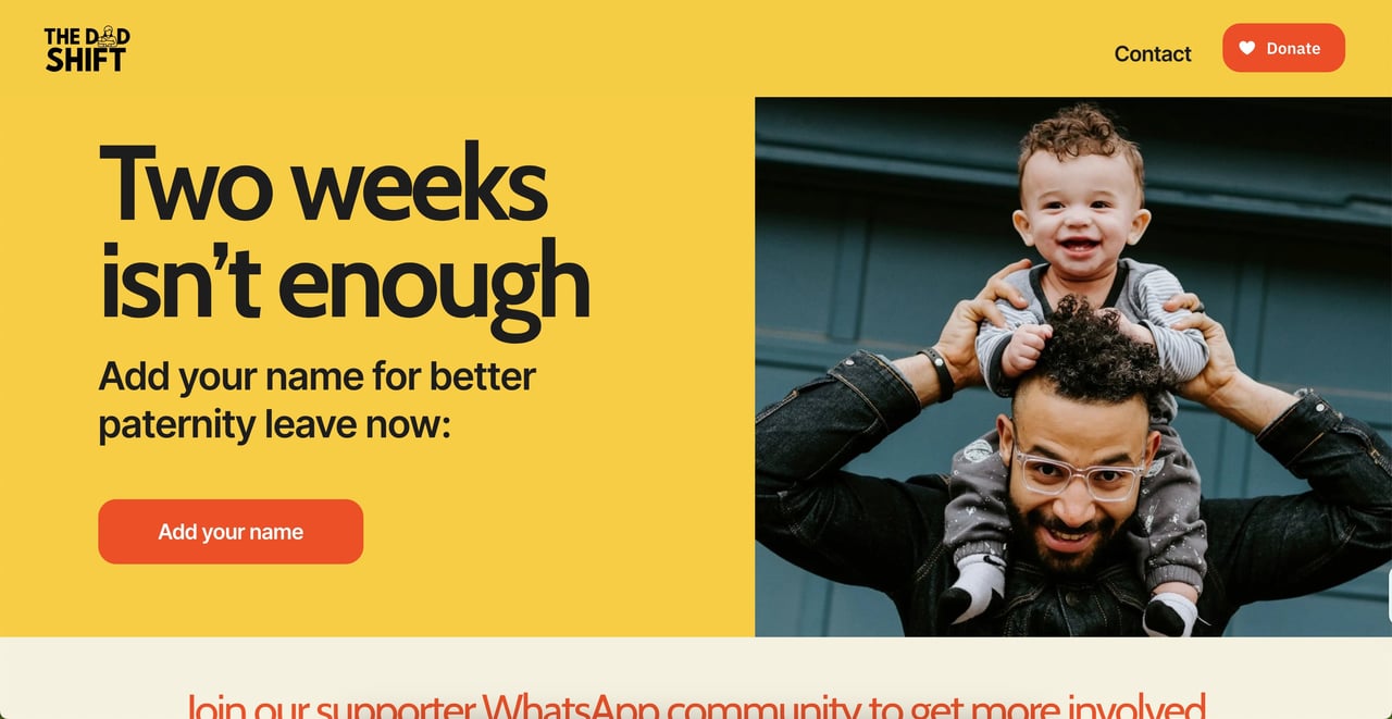
8. The Dad Shift’s “Dad Strike”: guerrilla stuff, straight from the pavement
In June 2025, a UK grassroots group called The Dad Shift hung baby slings on statues — Brunel, Thierry Henry — the kind of image that begs to be photographed. Then they staged a “Dad Strike,” dads and babies protesting in London and Edinburgh for paternity leave longer than the UK’s measly two weeks. The statues got shared, the strike got a demand attached, MPs piped up, the Financial Times and other journalists covered it, and a niche cause turned into a national conversation. Cheap, visual, punched way above its weight.

What the ALS Ice Bucket Challenge and other classics still teach us
Fine, the old ones. You can’t write about PR campaigns and pretend they don’t exist, and the learnings genuinely still hold. The ALS Ice Bucket Challenge raised $115 million for the ALS Association because it was stupidly easy to join and even easier to dare a friend into. Coca-Cola’s Share a Coke put your name on a bottle and sent you hunting for it. Dove’s Real Beauty picked a fight with beauty standards. LEGO’s Rebuild the World made creativity the brand. Different mechanics, same skeleton — one idea people actually want a part of. The 2025–2026 campaigns are that skeleton in newer clothes.
Why Burger King keeps showing up in PR campaign roundups
Because it never flinches. The Moldy Whopper literally showed a burger rotting to make a point about preservatives — gross, brave, unforgettable. The Whopper Detour sent people into a McDonald’s car park to unlock a one-cent burger and pulled 1.5 million app downloads, 3.5 billion earned-media impressions, and a Cannes Grand Prix. KFC’s “FCK” apology, after it ran out of chicken, is the crisis version of the same nerve: own it, be human, move on. Coca-Cola, Burger King, KFC — none of them plays it safe, and none of them gets forgotten.
How to build a PR campaign that earns brand awareness
You don’t need a Coca-Cola budget. You need a process, and it’s shorter than agencies want you to believe. The napkin version:
Set one goal. One. Awareness, a perception shift, a launch — pick a lane. Vague campaign goals give you vague results and a nervous client.
Know exactly who you’re talking to. Run a little brand analysis first so the message and the channels aren’t a shot in the dark.
Find the idea, then sit on it. Brainstorm, sleep, come back. If you can’t say it in one sentence, it isn’t ready.
Listen before you leap. See what competitors and the public are already saying — this is where social listening tools and ongoing brand monitoring save you from launching something that’s already everywhere.
Pick channels like you mean it. TikTok, Instagram, Facebook, Pinterest, press, events, influencer partnerships — match them to the audience, and don’t paste the same content creation across all of them and call it a strategy.
Pitch real journalists. A sharp, relevant pitch beats a 200-name blast every single time.
Launch, then chase. Around campaign launches, silence is normal — inboxes are buried. A follow-up with a fresh stat usually shakes the story loose.
Measure it. Which, conveniently, is next.
How to measure PR campaign performance
So did your campaign work? Track media coverage, share of voice, sentiment, engagement, and the stuff that pays the bills — traffic, leads, sales. The one metric I’d watch closely is the ratio of positive to negative mentions (sometimes called NSR). It’s the difference between attention that helped your brand reputation and attention that quietly torched it.
Doing this by hand falls apart the second a campaign gets big. A tool like YouScan pulls mentions, sentiment and reach into
social listening dashboards automatically, and it now reads Moltbook monitoring as a source too. New to a metric? The social listening glossary is right there. And AI social listening makes the whole thing faster, which matters when a client wants the impact proven by Friday. Try it today!

FAQ
What is a PR campaign?
A planned series of activities built around one message, aimed at a specific audience, over a set period. Public relations campaigns come in a few flavours — product launches, awareness pushes, purpose-led moves, crisis responses — but they all chase earned attention instead of paid ads.
What are some good PR campaign examples?
Recent ones I’d point to: Vaseline Verified, IKEA’s “The Co-Worker” on Roblox, Sweaty Betty’s #WearTheDamnShorts, and Lupa Pizza’s £100 Hawaiian. Lupa is the best example of a low-budget win — it landed in The Guardian, CNN and Reuters without spending a penny on media.
How much does a PR campaign cost?
Depends entirely on scope, the agency, and the channels. An agency can run anywhere from a few thousand dollars a month to $50,000+. But Lupa Pizza is your reminder that a sharp idea can earn global coverage for next to nothing — the company spent close to zero and still went worldwide.
How do you measure a PR campaign’s success?
Media coverage volume, share of voice, sentiment, engagement, referral traffic, and business outcomes like leads or sales. A social listening platform makes it far less painful by gathering everything in one place so you can show the results without a spreadsheet meltdown.
Curious what people are already saying about your brand? Book a demo and let YouScan turn the live conversation into the raw material for your next PR campaign.